Impress Your Friends And Family With Data Visualization!
We now have a working two dimensional particle swarm optimizer that can reliably minimize simple problems. That’s pretty cool, but you have to be a computer geek to really appreciate it. Give this program to a non computer geek and all they’ll see is a boring command line tool that spits out answers to obvious problems. They don’t understand all the nifty logic going on behind the scenes.
So why not show it to them?
Our swarm is made up of particles that each have a known x and y value. We can graph those points to show what kind of guesses the particles are making at any given point in time. Even people who don’t understand exactly what your program is doing will be impressed by a series of fancy graphs.
I mean, they *might* be impressed. You never know. You must have at least one friend that really likes graphs.
Enter the gnuplot
How to go about turning our swarm data into a swarm graph? Well, we could write our own custom Lisp code for graphing data… but why bother? There are tons of graphing programs already out there and the more time we spend on graphs the less time we have to spend on artificial intelligence. Life is about prioritization!
So what do we need in a graphing program? Honestly, just about any program that can read data from a file and produce scatter-plots from it is good enough for us. You could probably do it with an Excel macro, for example.
But since I’m on a Linux machine at the moment the most convenient option for me is a handy program called “gnuplot”. It’s a powerful graphing tool with tons and tons of options; way more than I could cover in a single blog post. But after messing around for a few hours I figured out some syntax to create one big file that can generate multiple graphs all at once. Perfect for printing out our entire swarm history all in one go!
It looks a little like this:
set terminal png x000000
set nokey
set border lc rgb "#00FF00"
set title "Swarm Minimization: x^2 + y^2" textcolor rgb "#00FF00"

set output 'plot0.png'
plot [-10:10] [-10:10] '-' using 1:2 pt 7 lc rgb "#00FF00"
0.3288231 9.875179
3.6807585 7.472683
-8.19067 -3.7102547
-1.549223 -8.636032
3.1139793 1.0444632
EOF
set output 'plot1.png'
plot [-10:10] [-10:10] '-' using 1:2 pt 7 lc rgb "#00FF00"
8.927804 -4.897444
-10 3.5666924
1.7747135 2.2790432
10 5.109022
10 5.0106025
EOF
The first four lines set up some generic style rules for our graphs. I start by setting the default graph to be an all black PNG image. I then turn off the automatic legend and set the line color (lc) of the graph border to be bright green (since the default black won’t show up against a black background). Finally I add a big green title to the top of the graph.
After that I pick out a name for the file where I want to save the first graph by using set output. Then I use the plot command to actually make the graph, which gets a little complicated.
The first two inputs to plot are the x and y boundaries we want to use in our graph. The third argument is the location of the data we want to graph. Normally this would be a filename, but ‘-‘ using 1:2 lets us instead just type the data we want right into the same file. After that we use pt 7 to choose how we want to draw our data points (7 is code for a filled circle) and use lc again to make our points just as green as our boundaries and title.
With all that out of the way we can finally include the data we want to graph. Each point is represented by two numbers, on their own line and with a space between them. After typing in all the numbers we use EOF to indicate that’s the end of our fake little inline data file.
Then we choose a filename for our next graph with another set output, repeat the plot command and then include the next set of data. And we do that again and again until we’ve graphed all the graphs we want graph.
Formatting Data
With that example file to work with we can start working on some Lisp to grab our swarm history and rearrange it into a gnuplot input file.
The first obstacle we have to deal with is the fact that our swarm intelligence stores history as a list of particle histories. This makes it very easy to grab and read the complete history of any individual particle. Unfortunately, when it comes to graphing we want to do the opposite. Instead of the complete history of one particle we want a single step in the history of every particle.
Example: If we want to draw a graph of how the swarm looked during its third loop through our algorithm we would need the third entry in the history list for every single particle. If we wanted to draw the swam during it’s sixth loop we would need the sixth entry in the history list of every single particle.
Fortunately this isn’t hard thank to loop (again!) and the handy nth function. Like you might expect, the nth function lets you grab items from anywhere inside a list.
(defun get-swarm-history-step-n-2d (swarm-history step)
   (loop for history in swarm-history
      collect (nth step history)))
These three lines of code are all that we need to get a snapshot of the entire swarm at any point in its history.
Efficiency Warning
One quick note here for all you efficiency buffs out there. Lisp lists are wonderful and flexible data structures but they aren’t always the fastest.
The main problem is that you can’t just grab random items out of a list, you have to visit them in order. To get to the third item in a list you first have to grab the first item. The first item tells you the location of the second item, and then the second item helps you find the third item. Now if you instead wanted to find the one millionth item in a list… well you can see how that could start to be a waste of time.
For small amounts of data this isn’t a problem. But when you really need fast access to data no matter where it is inside a list you would probably be better off with something that does allow random access, like an array. Which Lisp supports. So if you want to slightly boost the speed of your swarm that’s one change you could make.
Printing The Data
Now that we can grab slices of swarm history we can put together one last big function to take one slice from every step in the swarm’s history and glue them all together into a file for gnuplot.
(defun print-swarm-history-graph-file-2d (filename swarm-history title x-bounds y-bounds)
   (with-open-file (stream filename :direction :output)
      (format stream "set terminal png x000000~%")
      (format stream "set nokey~%")
      (format stream "set border lc rgb \"#00FF00\"~%")
      (format stream "set title \"~a\" textcolor rgb \"#00FF00\"~%~%" title)
      (loop for i from 0 to (1- (length (first swarm-history))) do
         (format stream
            "set output 'plot~a.png'~%plot [~a:~a] [~a:~a] '-' using 1:2 pt 7 lc rgb \"#00FF00\"~%"
            i (first x-bounds) (second x-bounds) (first y-bounds) (second y-bounds))
         (loop for position in (get-swarm-history-step-n-2d swarm-history i) do
            (format stream "~a ~a~%" (first position) (second position)))
            (format stream "EOF~%"))))
It’s a big looking function but most of that is just calls to format. Look at this function alongside the sample gnuplot file and it’s pretty easy to see what is going on.
One complication worth looking at is with-open-file. It let’s us create or open a file and then read or write data to it. In this particle case we use with-open-file to create a handle named “stream” pointing to whatever filename is stored in our filename variable. Then we can use (format stream “some text”) to send text to a file instead of to the screen.
And with that the rest of the function is pretty straight forward. We start out by printing all the special rules we determined we need at the beginning of every gnuplot file.
After that we can print the specific coordinates for each step with two nested loops. The first loop needs to run once for every step in our history and set. Then for each step the inner loop needs to get all the individual particle coordinates for that step and add them to the file.
The Moment You’ve All Been Waiting For…
[30]> (load “swarm.lisp”)
;; Loading file swarm.lisp …
;; Loaded file swarm.lisp
T
[31]> (defparameter *swarm-size* 25)
*SWARM-SIZE*
[32]> (defparameter *swarm-iterations* 70)
*SWARM-ITERATIONS*
[33]> (defparameter *swarm-output* (swarm-minimize-2d #’double-parabola ‘(-10 10) ‘(-10 10)))
*SWARM-OUTPUT*
[34]> (first *swarm-output*)
(-1.5024608E-4 0.0011557455)
[35]> (defparameter *swarm-history* (second *swarm-output*))
*SWARM-HISTORY*
[36]> (print-swarm-history-graph-file-2d “swarm-history.txt” *swarm-history* “Swarm Minimization: x^2 + y^2” ‘(-10 10) ‘(-10 10))
NIL
That produces a “swarm-history.txt” file that we can feed into gnuplot. Although I personally suggest you move it to a new folder first before running it. Generating dozens or hundreds of graphs all at once can make a real mess of your development folder. I did all my graph work in a folder named “output” to keep it separate from my code files.
Wherever you decide to do your work, generating your graphs is as easy as:
gnuplot swarm-history.txt
And now you have one PNG file for every guess your swarm AI made. You can finally see the code working.
The Really Cool Part
Now that we have a graph of every step in our swarm algorithm the only logical thing to do is string them all together into one big animation: a simple enough trick for a graphic manipulation tool like Gimp. I’ll leave it up to you to find a good tutorial on how that works.
Now we can finally see exactly what our swarm has been up to, and it was just what we expected.
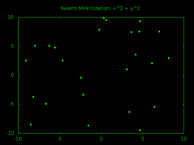
Look At That Swarm Swarming!
The swarm starts out spread out randomly all over problem space and the particles are moving very fast, bouncing around at high speeds and trying tons of different answers. After just a few rounds of guesses the particles start to gravitate towards (0,0), the true best answer of x^2 + y^2. As time goes on the particles start slowing down so they can better examine the promising answers near the center of the graph. Finally all the particles converge and stick to one best answer, or at least really close to it.
Next: More Data To Visualize
We now have all the tools we need to visually demonstrate the inner workings of our swarm intelligence (which is a great way to show off to friends). Next time we’ll put those tools to good use by thinking up some new equations for our swarm to optimize. We’ll also finally get around to improving our optimizer to maximize and search for target values instead of just minimizing.