Gengo Girls #51: AAAA

Gengo Girls #51: AAAA

The Japanese word “namae” sounds and awful lot like the English word “name”, which might make you think that one language borrowed it from the other (happens all the time). But in this case no borrowing happened! It’s just a bizarre coincidence that these two different, unrelated languages developed similar words for the idea of “name”.

Also, Gabriela and Schneider are both fairly common German names. This comic is not a reference to any particular Gabriela Schneider. Although in retrospect finding a way to work some obscure movie or historical reference into this strip probably would have been funnier than just choosing a random name…

Vocabulary

名前 = なまえ = name

Transcript

言語ガールズ #51

AAAA

Blue: In 日本語 you introduce yourself with the phrase 私の名前はNAMEです

Blue: 私はNAMEです is fine too.

Yellow: The family name comes first, right?

Blue: I’m glad you remembered.

Yellow: Let me give it a try:

Yellow: 私の名前は Schneider Gabriela

Blue: But… you’re name isn’t Gabriela Schneider.

Yellow: Wouldn’t it be cool if it was?

ComiPo! “Comic Maker” Review

Summary: ComiPo! makes it easy for non-artistic people like me to put together decent looking comics with a school or office theme. On the other hand its limited poses and outfits might be frustrating to some artists. So if you’re looking for a tool to help you illustrate a high school drama or workplace comedy ComiPo! might be just what you need, but if you’re trying to make a fantasy battle comic you’re better of just learning how to draw.

How ComiPo! Helps Me

I can’t draw. I can barely doodle. But I’m a big fan of gag comic strips and often wished I could make my own. So stumbling across ComiPo! was pretty exciting and I immediately downloaded the free trial to see what it could do. Thirty minutes later I had the prototype for Gengo Girls, my Japanese educational comic.

The demo seemed promising so I bought the full version of ComiPo! and here I am four months later with 50 complete comics.

The Good

ComiPo! is incredibly easy to use and basically idiot-proof.

You create new characters by picking and choosing facial features, hair styles and colors from a set of drop down menus. Everything matches up pretty well so your character is almost guaranteed to turn out great.

Then you build a comic by choosing a comic layout and dragging and dropping items into each comic panel. If you want two characters talking in the park you just grab the park background and drop it in your panel, then grab the two characters you want and drop them in too. You can rotate, re-size and re-position them however you want.

comipo_good

This is a hundred times better than anything I could have actually drawn

You pose characters by choosing from a list of over a hundred different options. Each pose is represented by a stick figure that shows you exactly what you’re about to get, so you don’t have to remember a lot of complicated names like “Running_3” or “Sitting_2”. Just click the image that’s closest to what you want your character to do and suddenly your character is running or singing or waving to a friend.

The same simple system works for facial expressions. You get a big list of different faces to look at and you just click on the one you want your character to have in the current panel.

Then from there you just drag and drop in some text bubbles and type in your dialogue. Maybe drag and drop in some props or special effects. Then you’re done. That’s all it took.

The Not So Good

Remember how I said ComiPo! was idiot-proof? Well, that’s mostly because they don’t let you do anything that might ruin your comic.

The biggest issue is that you can’t design your own character poses. You have to use the presets. That means it can be difficult to give characters unique body language and it’s more or less impossible to set up an interesting fight scene.

Now that’s not really a problem if you mostly plan on having characters walking around and talking to each other with only the occasional shove or punch at dramatic moments. And as a non-artist I wouldn’t want to try and manually pose a character anyways. But if you have very specific dreams of making characters dance or fight or wrestle you’re going to need something more flexible than ComiPo!.

Similarly you’re stuck using the school and office outfits that come with the software. You can’t build your own character models or design your own clothes. Then again, if you know how to build and pose 3D models you probably don’t need ComiPo! in the first place.

Limited poses and outfits mean that certain stories just won't work.

Limited poses and outfits mean that certain stories just won’t work.

There’s also an issue with the speech bubbles that kind of bugs me: They don’t have any sort of automatic text centering, so you have to manually indent and shift every line to make each bubble look good. You could probably get around this by using ComiPo! to make your comic and then adding in the text with a different tool, but it would have been nice if ComiPo! could have done it all on it’s own. It took a while but a recent update finally added text alignment tools. Making natural looking speech bubbles is pretty easy now.

Final Recommendation: ComiPo! will not make you an artist, but it does let you easily build pleasantly generic comics. From there it’s up to you and your dialogue to make a story or a gag that people will want to read. So if you’re a writer who wants to try their hand at comics you might as well download the free demo* and see what ComiPo! has to offer.

* The free demo lets you see how the software works but limits you to half-page comics and only has a couple of different character and background options. The full version has both male and female characters, tons of style options, hundreds of backgrounds and the ability to create full-page comics.

Gengo Girls #50: Mine! Mine! Mine!

Gengo Girls #50: Mine! Mine! Mine!

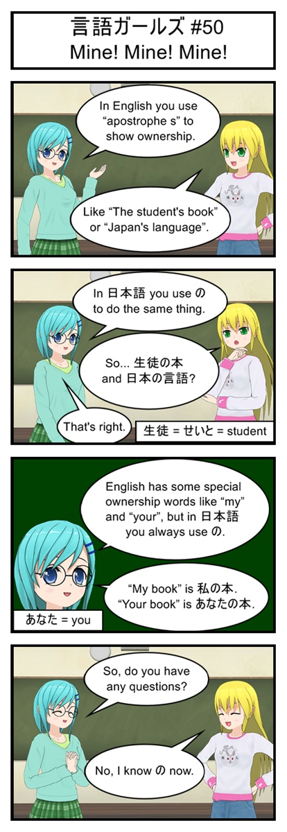
“anata” is kind of weird. It has a kanji symbol but it usually gets written using hiragana instead. I have no idea why. That’s just how it’s done.

Vocabulary

生徒 = せいと = student

貴方 = あなた = you (polite, usually written in hiragana)

Transcript

言語ガールズ #50

Mine! Mine! Mine!

Blue: In English you use “apostrophe s” to show ownership.

Yellow: Like “The student’s book” or “Japan’s language”.

Blue: In 日本語 you use to do the same thing.

Yellow: So… 生徒の本 and 日本の言語?

Blue: That’s right.

Blue: English has some special ownership words like “my” and “your”, but in 日本語 you always use .

Blue: “My book” is 私の本. “Your book” is あなたの本.

Blue: So, do you have any questions?

Yellow: No. I know now.

Gengo Girls #49: Inexpert Opinion

Gengo Girls #49: Inexpert Opinion

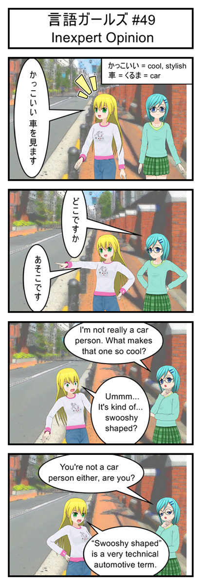
Remember, the marks the object of the sentence. In this case it marks exactly what is being seen.

We also have some good examples of implied sentence subjects here. In fact, none of the three Japanese sentences in this strip had an explicit subject.

In the first sentence it’s obviously the speaker who has just seen something because you don’t generally start conversations by telling other people what they see. (You might ask them if they saw something, but you wouldn’t just tell them.) There was no need to start with something like “Watashi wa”.

Then from there it’s obvious that the other two sentences are focused on the car that got brought up in the first sentence, so there’s no reason to explicitly mention it again and again.

Vocabulary

かっこいい = cool, stylish

= くるま = car

Transcript

言語ガールズ #49

Inexpert Opinion

Yellow: かっこいい 車を見ます

Blue: どこですか

Yellow: あそこです

Blue: I’m not really a car person. What makes that one so cool?

Yellow: Umm…. It’s kind of… swooshy shaped?

Blue: You’re not a car person either, are you?

Yellow: “Swooshy shaped” is a very technical automotive term.

Gengo Girls #48: Co-dependence

Gengo Girls #48: Co-dependence

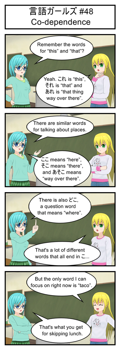
Here’s another set of super common words to help round out your vocabulary. They’re short and easy to understand too so see if you can pick them out of your favorite Japanese media.

The difference between “soko” and “asoko” is a lot like the difference between “sore” and “are”. When talking about a place far from you but close to your listener you use “soko”. When talking about a place far away from both of you you use “asoko”. That general guidline should get you through most situations until you start to pick up a real instinct for which word to use when.

Vocabulary

ここ = here

そこ = there

あそこ = way over there

どこ = where (question word)

Transcript

言語ガールズ #48

Co-dependence

Blue: Remember the words for “this” and “that”?

Yellow: Yeah. これ is “this”, それ is “that” and あれ is “that thing way over there”.

Blue: There are similar words for talking about places.

Blue: ここ means “here”, そこ means “there”, and あそこ means “way over there”.

Blue: There is also どこ, a question word which means “where”.

Yellow: That’s a lot of different words that all end in

Yellow: But the only word I can focus on right now is “taco”.

Blue: That’s what you get for skipping lunch.

Let’s Program A JavaScript Game 12: Making A STATEment

I’m Pretty Sure This Is What That Word Means…

There are two common definitions of “Game State”. At least two that I’ve heard. Who knows whether or not the big time developers use these. But my blog, my definitions. So… Game State:

The first definition is: A complete description of exactly what is going on in the game including the value of every variable. Very useful for creating save files or debugging glitches.

The second definition is: A high level description of what the game is currently doing, such as “paused”, “saving”, “in combat” or “showing world map”.

Our big focus today is going to be on the second definition, which is going to help us add a “Start Screen” and “Game Over Screen” to our current code. Or in other words, we are going to change from a game that only has one state (running) to a game that has three states (start, game over, main game).

But it’s not enough to have different game states. You also need a plan for switching between those game states. How does the player get to the “game over” state? Once he is in the “game over” state, how can he get back into the “main game” state? That sort of stuff.

This can all be described pretty well with a quick flowchart. Here’s an example of the four game states we want for Defrag Cycle and how they are related (although we’re only building three of them today:
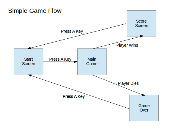
Everybody Loves Flowcharts!

Everybody Loves Flowcharts!

Pretty simple, right?

Of course, not all games are so straightforward. For example, here is a sample state chart for a generic RPG:
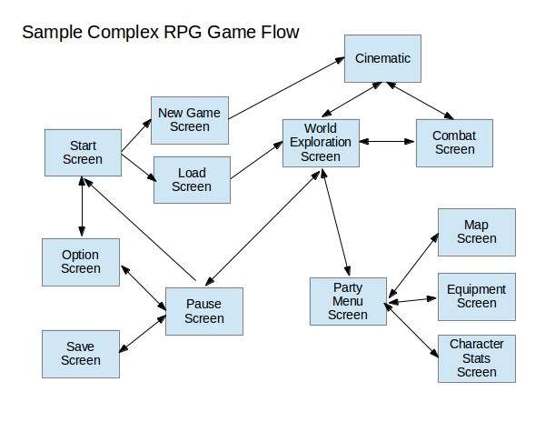
Whoops, looks like I forget to add a “game over” state, so let's just pretend this chart is for one of those games where losing a fight just sends you to the nearest hospital/temple/inn.

Whoops, looks like I forget to add a “game over” state, so let’s just pretend this chart is for one of those games where losing a fight just sends you to the nearest hospital/temple/inn.

Bonus Activity: Take your favorite game and try to draw a game state flowchart for it. Pay special attention to the transitions between states. Try to figure out which transitions go both ways (you can go from main game to pause screen and pause screen to main game) and which are one way (you can go from main game to game over, but it’s a one way trip).

Simple State Switching

First up we’re going to need a global variable for keeping tack of what state the game is in, along with some predictable values for the states themselves. So let’s just stick this somewhere near the top of our script along with the rest of our global variables and setup code:

//Game State "constants" (Javascript does not support true constants)
var STATE_RUNNING = 1;
var STATE_START_SCREEN = 2;
var STATE_GAMEOVER = 3;
var STATE_WIN = 4;

//Current Game State. Start game in "Start Screen" state
var gameState = STATE_START_SCREEN;

Now to put those states to good use. Update your gameLoop function like this:

//The main game loop
function gameLoop(){
   var startTime = Date.now();
   
   if(gameState == STATE_START_SCREEN){
      updateStartScreen();
      drawStartScreen();
   }
   else if(gameState == STATE_RUNNING){
      updateGame();
      drawScreen();
   }
   else if(gameState == STATE_GAMEOVER){
      updateGameover();
      drawGameoverScreen();
   }
   else if(gameState == STATE_WIN){
      // We'll implement this later
   }
   else{ //Fix the game if we somehow end up with an invalid state
      gameState = STATE_START_SCREEN;
   }

   var elapsedTime = Date.now()-startTime;
   
   if(elapsedTime>=50){ //Code took too long, run again immediately
      gameLoop();
   }
   else{ //Code didn't take long enough. Wait before running it again
      setTimeout("gameLoop()",50-elapsedTime);
   }
}

Can you see what we’re doing? The main gameLoop logic is the same as always. Make a note of what time it is, do some useful work, see how much time has passed and then decide when to run the next gameLoop. The big difference is that we now use the gameState variable to decide what kind of useful work we do.

When the state is STATE_RUNNING we just run the same old updateGame and drawScreen logic that we’ve already written. No need to make any changes here, unless you want to give them better function names like updateMainGame or updateRunningGame or something. I’m not going to mess with that just right now.

When the state is instead set to the start screen or the gameover screen we skip the game updates and instead run new functions specifically designed for those states. Functions that we haven’t written yet, but will in just a second.

As a side note, state switching like this can be an easy way to do pause screens. The main game update function only gets called during STATE_RUNNING, so by switching to a different state you can basically freeze the game world by preventing enemy and player position variables from updating.

New Code For Our New States

So… what should a start screen and an gameover screen actually do?

It seems to me a simple online game startscreen needs to do three things:

  1. Show the game’s title
  2. Explain how to play
  3. Explain how to move from the start screen to the main game

Similarly a gameover screen has two jobs:

  1. Show a gameover message
  2. Explain how to move from the gameover screen back to the start screen

In a real game we would hire a real artist to design some attractive screens for us. They would probably choose some lovely fonts and throw together a cool background filled with lasers and explosions.

But this is a game programming tutorial, not a game design tutorial, so I’m just going to throw together some text and call it a day.

//Draw the start screen with game title and instructions
function drawStartScreen(){
   var canvas = document.getElementById('gameCanvas');
   var context = canvas.getContext('2d');

   //Draw background
   context.fillStyle = '#dcdcdc';
   context.fillRect(0,0,600,400);

   //Draw black text
   context.fillStyle = '#000000';
   context.font = 'bold 70px impact';
   context.fillText("DEFRAG CYCLE", 20, 150);
   context.font = '20px impact';
   context.fillText("- Defrag the hard drive by avoiding pits and viruses", 20, 200);
   context.fillText("- When the counter reaches 1000 GB you win!", 20, 230);
   context.fillText("- LEFT and RIGHT arrow keys to move", 20, 260);
   context.fillText("- UP arrow key to jump", 20, 290);
   context.fillText("- Graze viruses to speed up the defrag counter", 20, 320);
   context.fillText("- Press UP arrow key to start game", 20, 350);
}

//Draw the gameover screen
function drawGameoverScreen(){
   var canvas = document.getElementById('gameCanvas');
   var context = canvas.getContext('2d');

   //Draw background
   context.fillStyle = '#000000';
   context.fillRect(0,0,600,400);

   //Draw green text
   context.fillStyle = '#00CC00';
   context.font = 'bold 80px impact';
   context.fillText("GAME OVER", 40, 200);
   context.font = '30px impact';
   context.fillText("Press UP arrow to retry", 120, 250);
}

Now all that’s left to do is fill in those two new update methods, which is really easy since all they do is check for the up key and then switch states (remember the flowchart):

//Check to see if the user is ready to start the game
function updateStartScreen(){
   if(playerInput.up){
      gameState = STATE_RUNNING;
   }
}

//Check to see if the user is ready to restart the game
function updateGameover(){
   if(playerInput.up){
      gameState = STATE_START_SCREEN;
   }
}

And with that the game now starts on the start screen and can be transitioned to the main game by tapping up. We’ve also built in the link between the gameover screen and then start screen. All that’s left is to link in the main game to the gameover screen.

Once again this is pretty easy. We already have a deathCollision flag that’s being set everytime we hit a virus and we already check to see if the player has fallen off the bottom of the screen. All we have to do is find inside the main updateGame function (it’s right at the bottom):

//Reset the player to default location when they fall off the screen
if(player.y > 400){
   player.x = 100;
   player.y = 100;
}

And change it to this:

//Gameover if the player falls of the screen or has hit a virus
if(player.y > 400){
   player.x = 100;
   player.y = 100;
   gameState = STATE_GAMEOVER;
}

if(deathCollision){
   gameState = STATE_GAMEOVER;
}

And now the game can flow between all three different states. Just ram yourself into a virus or fall into a pit and watch that transition to gameover.

This Is Actually Pretty Terrible

So… those of you who tried out your updated code probably noticed that it’s a little rough around the edges. Actually, that’s an understatement. These edges are downright serrated:

  • You can see the cycle jerk back into default position after falling off the screen but right before the game over message
  • Even if you just tap the up arrow key it will usually skip through both the gameover and start screen too fast to see
  • If you hit a virus you will immediately hit it again after you restart the game

This is obviously not anywhere near playable. But our goal was just to get the state switching working and that we have done!

Next time around we’ll start cleaning up some of these issues in preparation for adding the scoring system and a way to actually win.
Gengo Girls #47: Tough Love

Gengo Girls #47: Tough Love

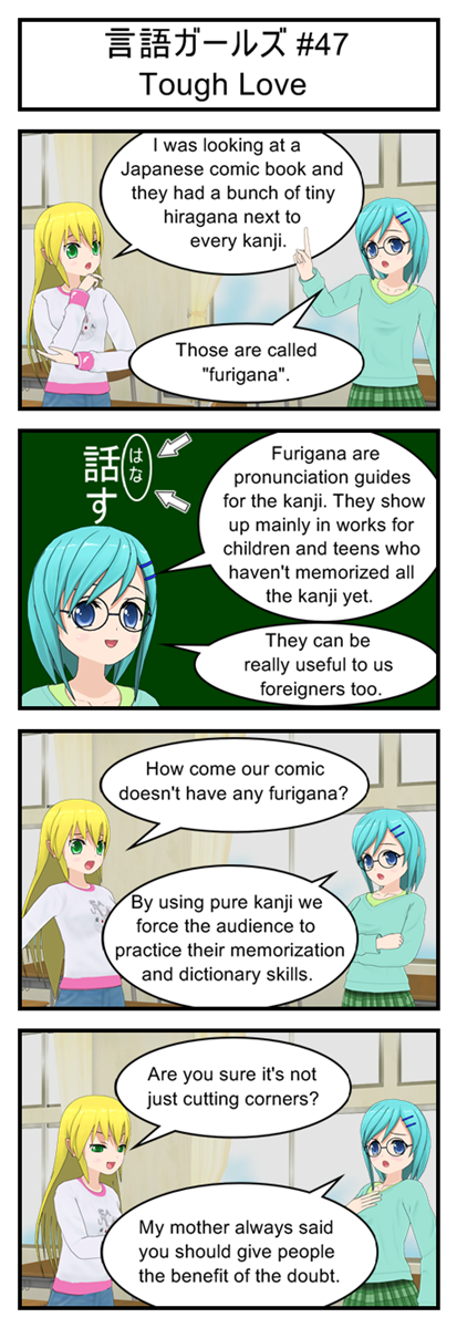
Have you noticed that after every comic there’s a transcript? And have you noticed that you can copy and paste kanji from this transcript? So if you can’t remember a word I’m using you can always just paste it into your favorite electronic dictionary to get the pronunciation and definition.

Although in the long run it’s probably better for you to do your best to memorize words when I first introduce them. And when you do forget a kanji it’s probably best if you try to look it up by radical or stroke-count before taking the easy way out and just copy pasting.

Transcript

言語ガールズ #47

Tough Love

Yellow: I was looking at a Japanese comic book and they had a bunch of tiny hiragana next to every kanji.

Blue: Those are called “furigana”.

Blue: Furigana are pronunciation guides for the kanji. They show up mainly in works for children and teens who haven’t memorized all the kanji yet.

Blue: They can be really useful to us foreigners too.

Yellow: How come our comic doesn’t have any furigana?

Blue: By using pure kanji we force the audience to practice their memorization and dictionary skills.

Yellow: Are you sure it’s not just cutting corners?

Blue: My mother always said you should give people the benefit of the doubt.

Gengo Girls #46: Object Oriented

Gengo Girls #46: Object Oriented

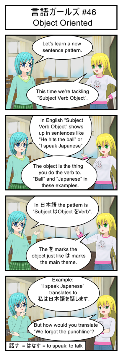
Objects really open up the sorts of sentences you can say. Now instead of just cryptically mumbling “I read” we can tell people exactly what we read. Instead of announcing “I see” we can tell people what we see. This is a definite upgrade!

Vocabulary

話す = はなす = to speak; to talk

Transcript

言語ガールズ #46

Object Oriented

Blue: Let’s learn a new sentence pattern.

Yellow: This time we’re tackling “Subject Verb Object”.

Blue: In English “Subject Verb Object” shows up in sentences like “He hits the ball” or “I speak Japanese”.

Yellow: The object is the thing you do the verb to. “Ball” and “Japanese” in these examples.

Blue: In 日本語 the pattern is “Subject Object Verb”.

Yellow: The marks the object just like marks the main theme.

Blue: Example: “I speak Japanese” translates to 私は日本語を話します.

Yellow: But how would you translate “We forgot the punchline”?

Gengo Girls #45: Cutting The Gordian Knot

Gengo Girls #45: Cutting The Gordian Knot

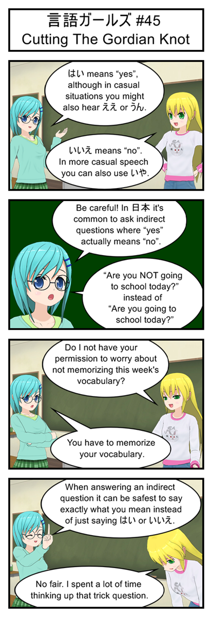
In English we use “yes” and “no” in a very flexible way. If someone asks “Are you not going to school?” we would interpret a “yes” to mean “Actually, yes, I AM going to school”.

But in Japanese “yes” and “no” are more literal. If someone asks “Are you not going to school?” an answer of “yes” means, “Yes, you are correct. I am NOT going to school.”

And since the Japanese love to pad their questions with polite modifiers that switch around the meaning of yes and no you can see why it’s a good idea to give a full answer to any question that you didn’t 100% fully understand. A native speaker might misinterpret what you mean by “yes” or “no” but there’s no room for confusion when you say “Yes, I want some ice cream”.

Vocabulary

はい = yes (polite)

ええ = yes (casual)

うん = yes (casual)

いいえ = no (polite)

いや = no (casual)

Transcript

言語ガールズ #45

Cutting The Gordian Knot

Blue: はい means “yes”, although in casual situations you might also hear ええ or うん.

Yellow: いいえ means “no”. In more casual speech you can also use いや.

Blue: Be careful! In 日本 it’s common to ask indirect questions where “yes” actually means “no”.

Blue: “Are you NOT going to school today?” instead of “Are you going to school today?”

Yellow: Do I not have your permission to worry about not memorizing this week’s vocabulary?

Blue: You have to memorize your vocabulary.

Blue: When answering an indirect question it can be safest to say exactly what you mean instead of just saying はい or いいえ.

Yellow: No fair. I spent a lot of time thinking up that trick question.

Gengo Girls #44: Walk A Mile In Their Shoes

Gengo Girls #44: Walk A Mile In Their Shoes

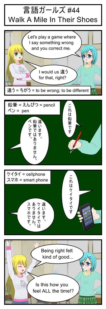
Lots of katakana today, so if you only memorized the hirogana you might need to reference a chart to memorize today’s vocabulary.

There’s probably some interesting cultural background to the fact that the Japanese use the same word (chigau) to mean both “to be different” and “to be wrong”, but I have no idea what. Was it considered more polite to tell people they were “different” instead of bluntly telling them they were “wrong”? Or was being different considered to be wrong? Or maybe it’s just the fact that being wrong means to say something that is different from the truth. Who knows? Not me.

Vocabulary

違う = ちがう = to be wrong; to be different

鉛筆 = えんぴつ = pencil

ペン = pen

ケイタイ = cellphone

スマホ = smart phone

Transcript

言語ガールズ #44

Walk A Mile In Their Shoes

Blue: Let’s play a game where I say something wrong and you correct me.

Yellow: I would us 違う for that, right?

Blue: これは鉛筆です

Yellow: 違います。鉛筆ではありません。ペンです。

Blue: これはケイタイです

Yellow: 違います。ケイタイではありません。スマホです。

Yellow: Being right felt kind of good…

Yellow: Is this how you feel ALL the time!?