Sorry For The Delay
My original plan was to show how to program a 3D web application from scratch, but after several rewrites I’ve come to the conclusion I can’t really do that without spending weeks worth of posts talking about general 3D programming. If that’s what you really want I suggest hitting this tutorial. Please note that none of their sample code will work unless you also download the helper libraries they provide in the online code repository. Just copy pasting their examples will fail without them.
As for me, I’m going to use a third party library to help us jump right into web based 3D without having to mess around too much with linear algebra and view frustums, which are all quite interesting but a bit too deep for the casual and fun game programming series I wanted to write here.
The particular library we’ll be using is called “three.js”, which can be downloaded at threejs.org. They also have plenty of documentation and examples there so if you find you enjoy the little application we’re writing here you’ll know where to go next to learn some more advanced tricks.
Let’s Get To Work
Go ahead and download three.js and grab the relatively small “three.min.js” file it comes with. Unless you’re planning on editing the library itself (and we aren’t) that’s all you really need so toss a copy of it into a new folder called something like “3dwebmaze” and create a blank “index.html” file right next to it. Now pop open your index in your favorite text editor and get ready for some coding.
First things first: we need to set up the basic webpage where all of our cool 3D stuff is going to happen. Our main requirements are to set up a canvas, make sure we load the three.js library and then tell the body of the webpage to trigger a script after it finishes loading. The script we want it to trigger will, of course, be the 3d maze program we’re going to write.
<html>
<head>
   <title>Maze With three.js</title>
   <script src="three.min.js"></script>
   <script>
      function runMaze()
      {
      }
   </script>
</head>
<body>
<body onload="runMaze();">
   <canvas id="mazeCanvas" width=600 height=450 />
</body>
</html>
With the boring stuff out of the way we can start writing some real code and filling in our runMaze function. Please note that every line of code in this particular post needs to go inside of runMaze.
The first thing runMaze needs to do is grab a reference to our canvas. Not only do we need to tell three.js where to find its drawing target, we also need to be able to grab the canvas’s width and height in order to fine tune various bits of our rendering process.
var mazeCanvas = document.getElementById("mazeCanvas");
After that we need to set up three js itself. First up is a “scene” whose job is to keep track of all the objects we want to draw. Just creating a 3D shape isn’t enough, you have to add it to the scene for anything to happen.
var scene = new THREE.Scene();
Next we need to set up the renderer, which does all the work of actually drawing things. By default the renderer will try to create a brand new canvas but if you already have one you can pass a reference to it. Notice that we’re passing WebGLRenderer an anonymous object with a “canvas” property. Just passing the canvas reference alone won’t work; this function, like a lot of three.js, expects an object full of setup details instead of direct arguments.
var renderer = new THREE.WebGLRenderer({ canvas: mazeCanvas });
The last thing we need is a camera, which helps the renderer figure out exactly how things should be drawn to the screen. The camera needs four pieces of information to work properly, so buckle yourself in for a wall o’ text.
The first camera argument is “field of view”, which is kind of a weird idea. Think of it like this: humans and cameras see the world through a cone shape. Up close you can only see things right in front of you (like a single tree) but the farther away things are the wider an area you can see all at once (like miles of distant forest). Well field of view is just a measurement of what kind of vision cone you want your camera to have. Will it be a big wide panoramic camera or will it be more focused? The “best” cone shape depends heavily on what kind of scene you want to draw. For now we’ll choose a cone with a 75 degree angle and then tweak it later if we think that’s too wide / not wide enough.
The second piece of camera information is aspect ratio, or the shape of the final picture. This needs to match whatever you canvas size is or else things will get stretched and squished just like when you accidentally try to watch an old movie on a widescreen TV. The easiest way to make sure it’s right is to just calculate the aspect ratio on the spot based on the same canvas reference we passed to the renderer. That way if we later decide to change the size of the canvas the code here will automatically update the next time we reload the page.
The last two pieces of information are the minimum and maximum distances you want objects to appear at, commonly called the near and far plane of the view frustum. Anything closer to you than the near limit gets ignored (useful for making sure you don’t draw things behind or overlapping with your camera). Anything beyond the far limit also gets ignored (useful for making sure you don’t waste processing power drawing objects so far away they would barely be a blip on the screen anyways). Once again the exact values for these depend on what kind of scene you’re programming so for now we’ll just use the default values from the three.js online tutorial and then change them later if that doesn’t work.
Put those four pieces of information all together and we get this:
var camera = new THREE.PerspectiveCamera( 75, mazeCanvas.width/mazeCanvas.height, 0.1, 1000 );
With that three.js is all set up and ready for us to start building mazes.
I think it’s safe to say that the most important part of a maze is the walls. You can get away with leaving off the ceiling and people usually don’t look too closely at the floor but without walls it’s not a maze at all. So let’s draw some walls.
In general the easiest way to draw a wall is to just make a 2D rectangle and stick it the way of the player, and after a little experimentation I found that a wall twice as wide as it is tall seems to look the best. But exactly how tall should it be?
If this was a real life maze we’d probably base the height of our maze walls off of the average height of the people we want to explore it. Example: Almost all humans (at the time of this writing) are less than seven feet tall so an eight foot high wall should be enough to prevent anybody from bumping their head.
But this isn’t a physical maze. It’s a 3D graphics maze and the imaginary cameraman running through the maze is exactly 0 units tall and has no head to bump. That means that exact size of our walls doesn’t actually matter. We could make our walls HUGE and still get them to fit on screen by just putting them far away. We could also make them super tiny but still have them feel taller than the player by just putting them close together and right in the front of the camera. What matters isn’t the size of the wall, but the ratio of its size and camera distance.
This is nice because it means we can set the scale of our maze to whatever is most convenient to work with and then adjust the camera until everything looks appropriately player sized.
Now it seems to me that the most convenient scale for a grid based maze is to let every grid square be one unit wide and one unit long. That way we can easily convert between maze locations (column 5, row 3) and 3D positions (x:5, z:3). And of course if the grid squares are one unit wide every wall will also be 1 unit wide and to get the proper 2-to-1 width to height ratio that means every wall will be 0.5 units tall.
So now that we know what size our walls are going to be let’s finish up this post by building one and drawing it to screen. It will be one unit wide, half a unit tall and we will put it half a unit away from the camera. Since the camera, by default, sits at (0,0,0) and faces in the negative Z direction that means we want to put the wall at (0,0,-0.5).
Digital Carpentry
To build this wall we need two things:
1) Some geometry describing the shape of the wall
2) A “material” describing how the wall should be colored and textured.
var wallGeometry = new THREE.PlaneGeometry( 1, 0.5 );
 var wallMaterial = new THREE.MeshBasicMaterial( );
 var wall = new THREE.Mesh( wallGeometry, wallMaterial );
 wall.position.z = -0.5;
 scene.add( wall );
For our geometry we used a simple plane, basically a flat rectangle with whatever width and height we want.
For our material we use the default MeshBasicMaterial. Without any special arguments this represents a simple flat coat of white digital paint. The only interesting thing about is that it’s a one sided texture; you can only see it from the front. Look at the wall from behind and it’s invisible. This is actually very useful (and efficient) because most of the time you only want to draw one side of a shape anyways. We will only ever look at our maze from the inside and a character like Mario should only ever be seen from the outside.
Now that we have our rectangle and our boring white material we can mix them together into a an actual useable 3D mesh. We then push its z position away from the camera by half a unit and add the final objection to our scene. Remember, only objects that are part of the scene get rendered!
But how do we make that rendering happen? Simple enough, we just have to set up a function with a few three.js hooks and then call it.
var render = function () {
   requestAnimationFrame( render );

   renderer.render(scene, camera);
};

render();
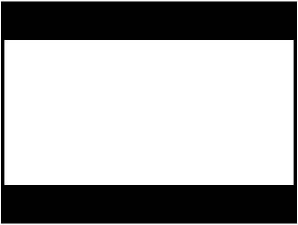
And with that we have a wall. A single, bland wall that frankly doesn’t look very 3D at all. We could have done the same thing with a single 2D draw rectangle call. But it’s a start.

Yes, it’s a boring screenshot but just think how easy it would be to compress!
Bonus Project!
Earlier I said that the exact size of our wall didn’t matter since we could make small walls look big by getting up close or big walls look small by backing away. Test this out by making the wall two or five or ten times bigger (or smaller) while also changing its z position to be two or five or ten times further away (or closer). You should notice that as long as the ratio of size to distance is constant you’ll get the exact seem fills-most-of-the-screen rectangle no matter what sizes you choose.
